How can we reduce packaging materials and create a more meaningful and creative design?
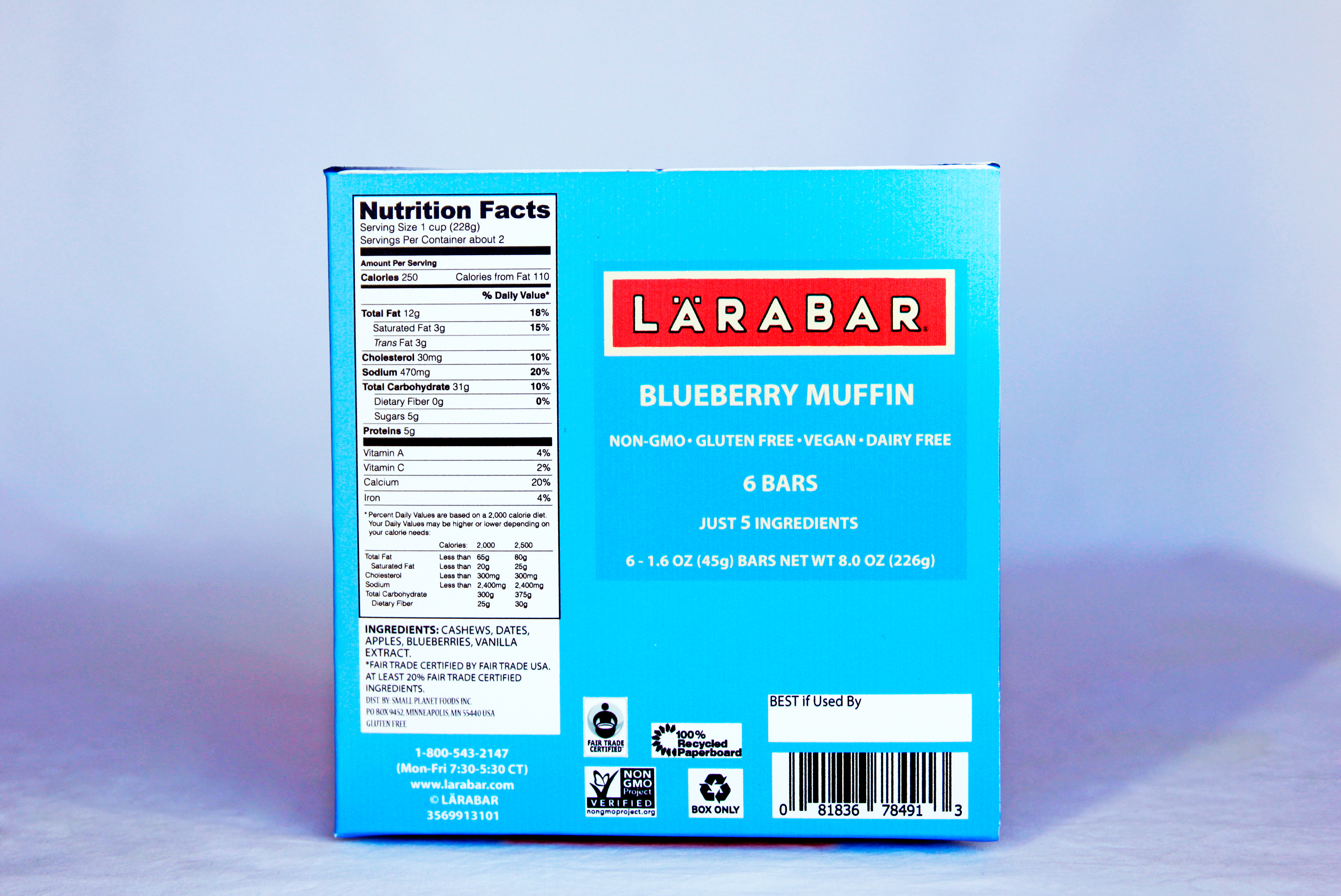
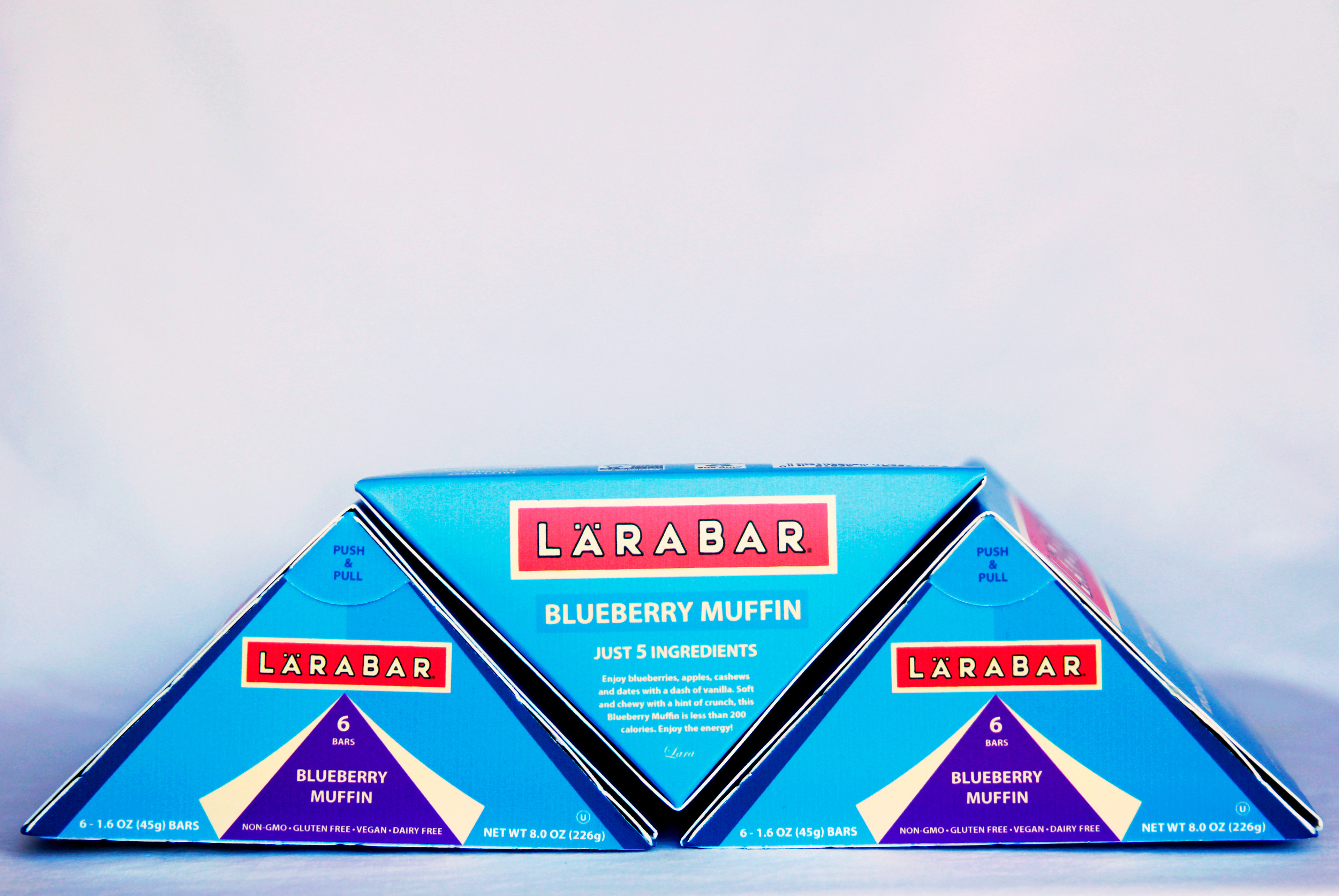
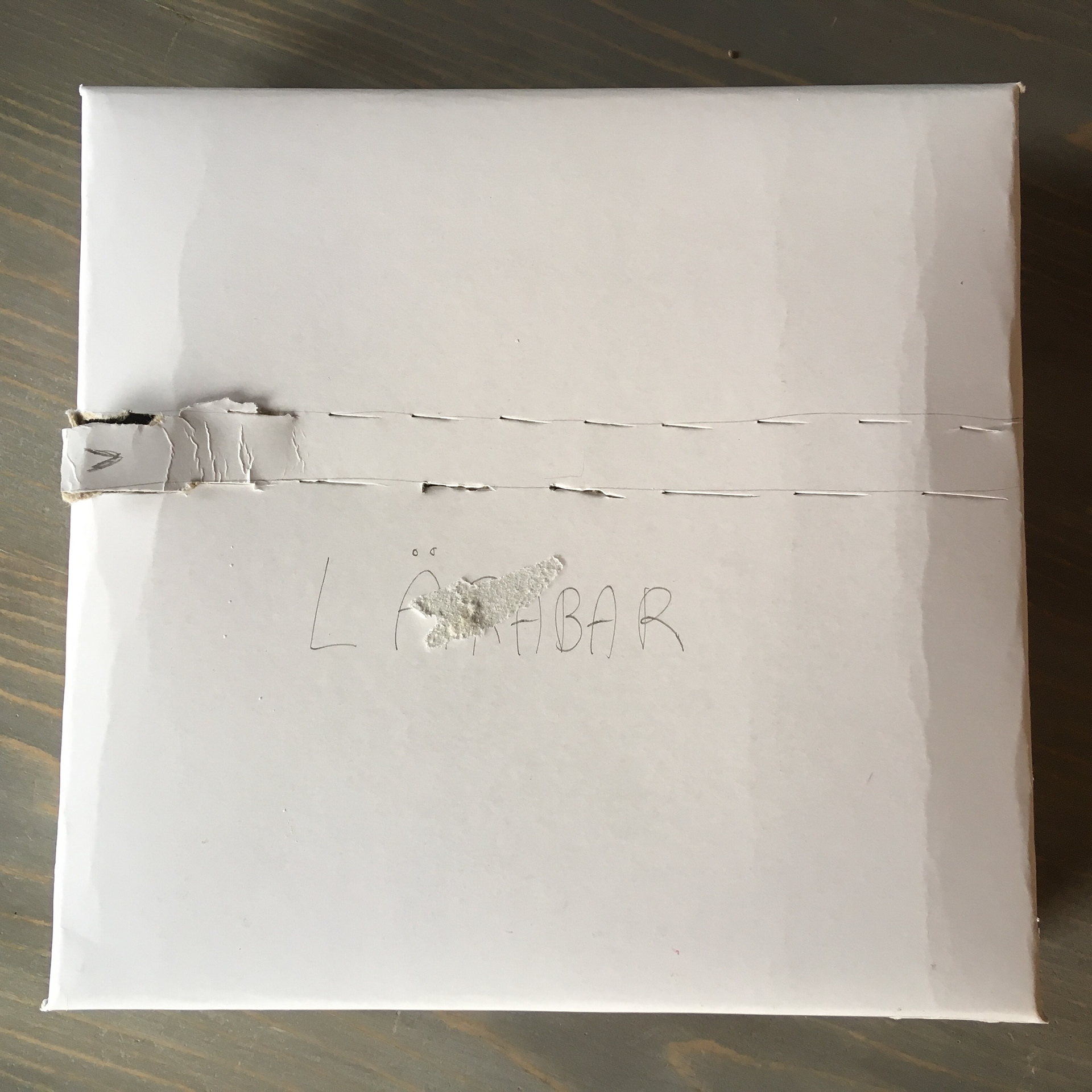
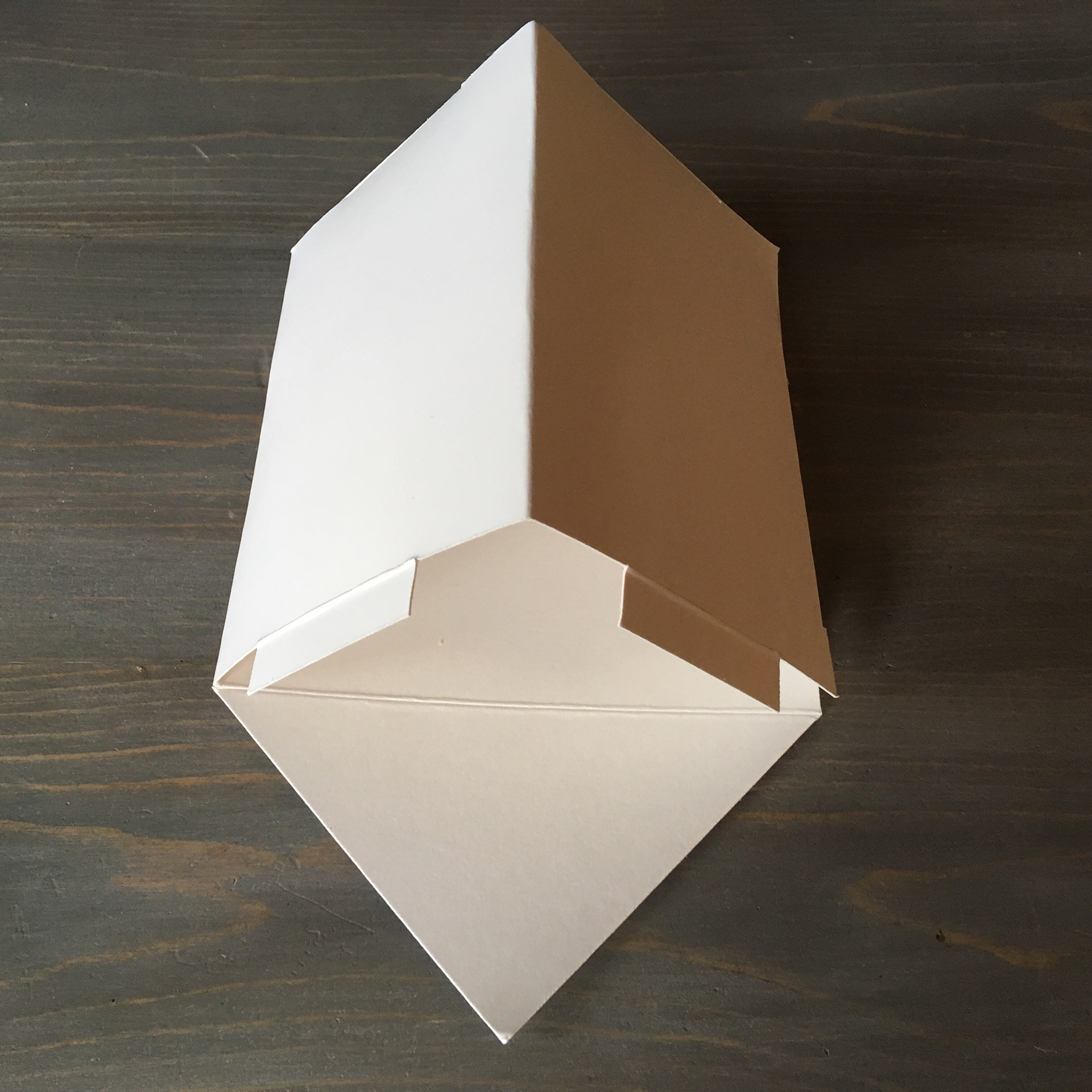
Our design minimized material use by over 20% in addition to creating a unique visual design resembling a tent, to match the outdoorsy mission of the company. Our design increases shelving stability and allows for creative stacking. Six granola bars fit perfectly inside, and consumers can easily access them by tearing off the triangular front panel.
{package design, visual design]


Here is the original box vs. our final dieline.
